Substance Abuse & Mental Health Data Archive (SAMHDA)
Full overhaul of the marketing pages for SAMHDA. The site had a very outdated look and feel. There was also an overwhelming about of textual content that was not clear. The content also had many overlaps to the main Data website. So our purpose was to modernize the site and create clear pathways to the data resources.
Challenge
See SAMHDA
One of the most challenging areas of the site involved the pathway to the data files. The files were 5 to 6 pages deep, buried in pages that repeated the same content over and over. The parent page talked about the survey collection. The sub page repeated the parent page information, but collapsed in an accordion after the first paragraph and then showed the studying information... and so on and so on.
My strategy was to:
- Remove content that was duplicated from the main Data website
- Condense the static information on to one page,
- And create an easy way to choose the dataset for download without leaving the page
The site went from hundreds of pages down to 12, 1 for each collection.
Methods
In order to understand the core challenges of the website, my team met with the CBHSQ organization through a series of listening sessions to gather their wishes for the website. We also had extensive user testing especially around the data files and bibliography pathways. And we involved statisticians as part of the core working team so that they could be available to offer their expertise.
Some artifacts created to help communicate the process both the clients for approval and the development team for building included:
- Competitive analysis
- Listening session summaries
- User testing Reports
- Wireframes, Color Comps, and Specifications
The site is a Drupal 9 instance, running on the USWDS theme.
Solution
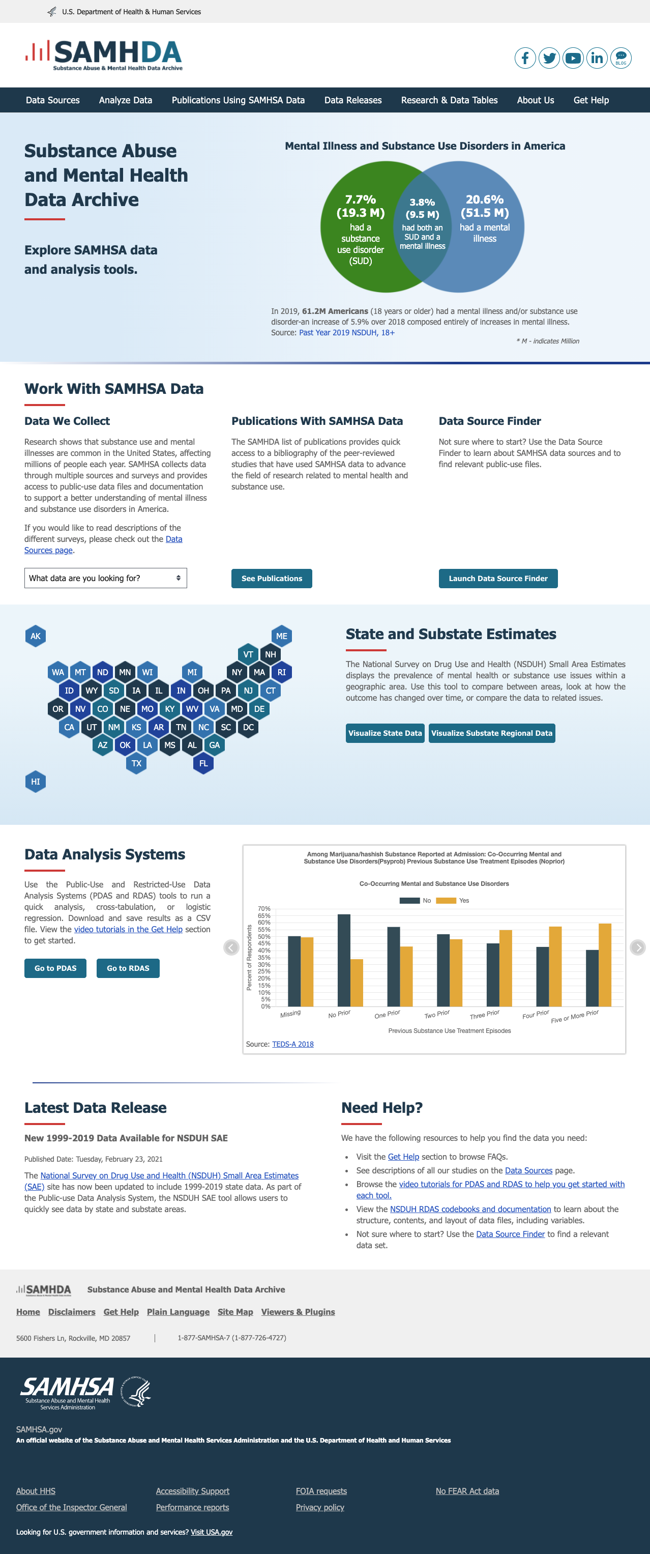
- The home page was updated to put a focus on data visualizations thereby showing the purpose of the site.
- At the same time, the visualizations were used to promote available tools
- Content was reframed to use publicly accessible language ... even over branded terms
- A wizard was added to help users identify which survey collection would meet their research needs
- A robust help section was build to that users could do more to self-service their needs
- And the U.S. Web Design System was used in coordination with Drupal 9 for compliancy with the 21st Century IDEA while at the same time giving the site a look and feel that helps to elevate the SAMHSA brand.

Home Page of live site