Office of Population Affairs (OPA)
OPA has a clinic locator that shows where the Title X clinics are. It is the main service they provide, along with reporting on clinic data.
Original Scope:
The original scope of the project was just to fix the database that housed the Title X clinics. The clinic location site had been down because of errors in the database, and traffic was being rerouted to AIDS.gov who had similar clinics. But it was imperative that the database be brought up so that OPA could remain the official source of this information.
Challenge:
As we began working with the OPA team we made several discoveries that impacted the project outside of just have a broken database. They had difficulty with keeping the clinic data up-to-date because the providers of the data, the grantees, were often too far removed from the clinics. The site was difficult to use and an outdated in look and feel. Further, they had problems with users accounts. Because they had architected the site with a 1 to 1 relationship between organizations and grantees, many grantees had to have multiple logins to manage their organizations and clinics. Another major issue was that they were created required reports manually, because they could trust the data that had.
Methods:
Collaborative Discovery
During the collaborative discovery phase, we employed to use of remote first meeting so that both the full working team and the full client team could participate. These session made sure that everyone was on the same page for understanding what we need to build. Read more about Collaborative Discovery
Rapid Strategy (Design Sprint)
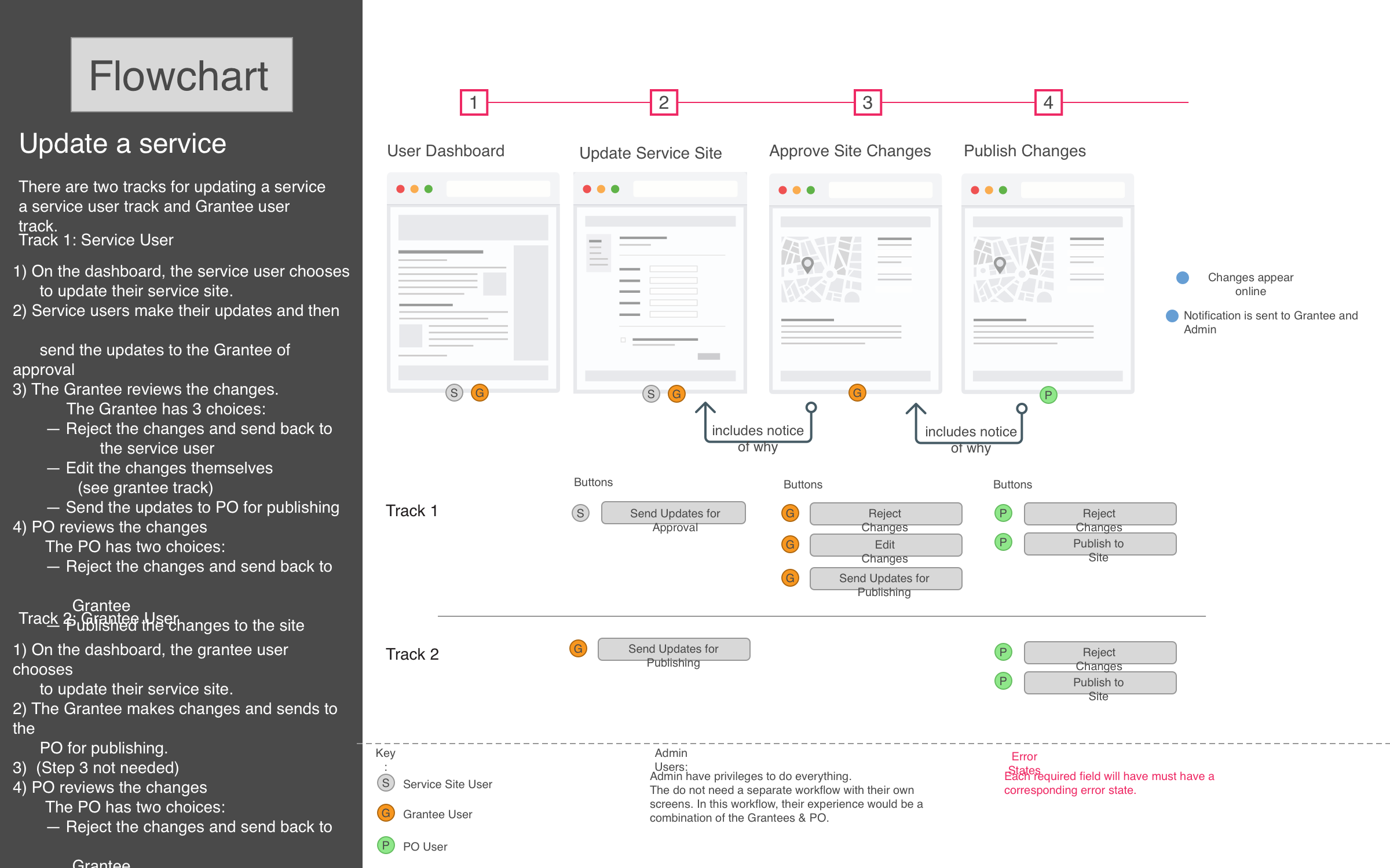
The team came together for a two day workshop. Part one was to align on our understanding. Application features had been decided through the discovery process and pathway documents were created to show how users would move through the system to access those features.
The work of the morning was to make sure that we all agreed on the user pathways and to make changes as needed. In part two, the team worked together to sketch out all the public pages. In part three each subject group divided out to refine our approach. UX designs updated the pathways, Visual designers created full color comps, Developers investigated how they would handle the more innovative concepts, and the PM, BA, and Lead Tech created the roadmap. The last section, we brought the client in and gave them a tour of all the work. They understood the full scope of what we were planning to build and were able to give their feedback and approvals on the spot.
And overarching process strategy was to be deliverables lite. We wanted to create documents that were polished enough to communicate. For instance, for most pages, wireframes were hand-sketched, approved by the client, and then build by the developer. Once developed, the visual designer would QA and add tweaks.
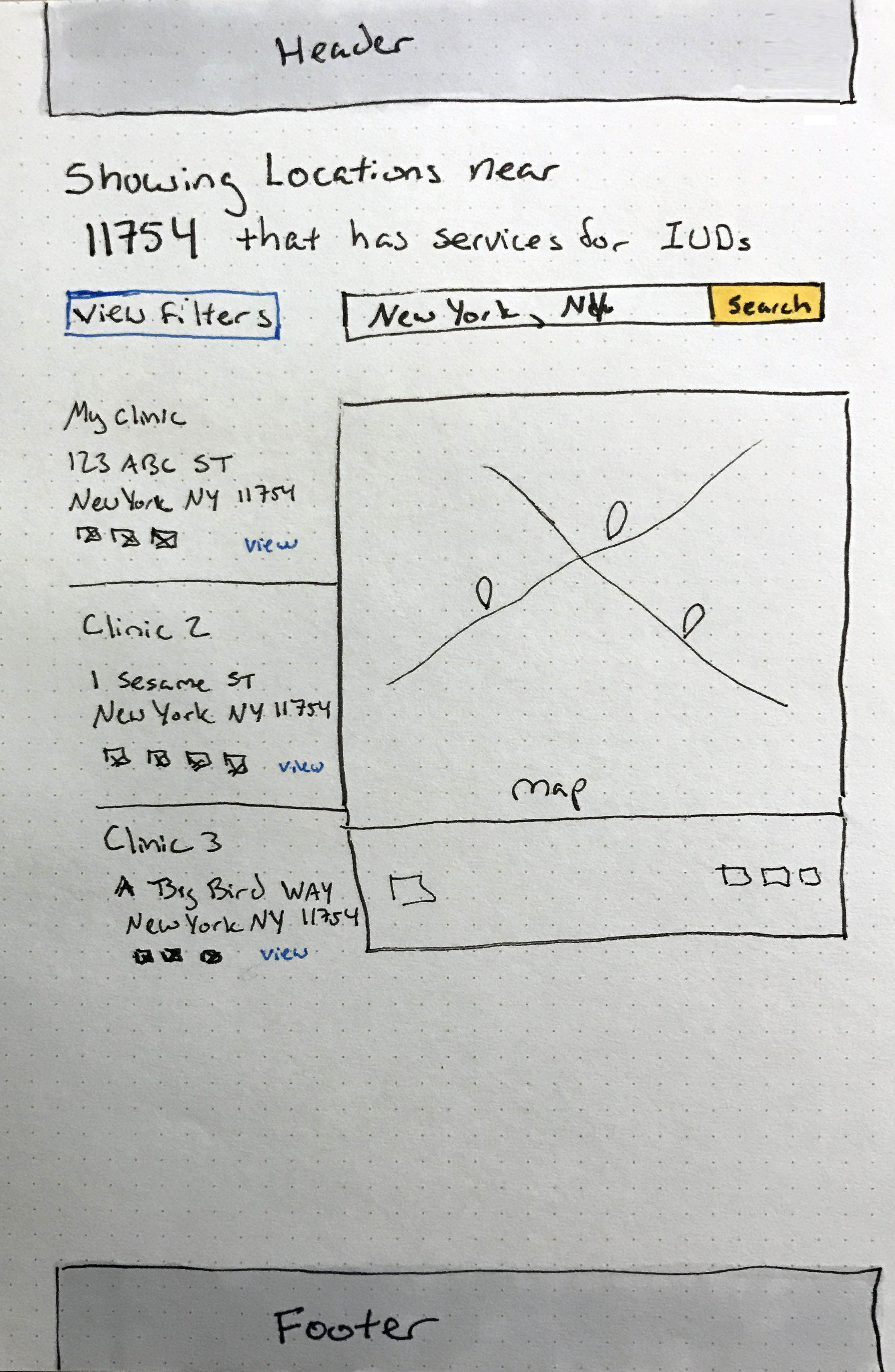
Hand sketch of search results page
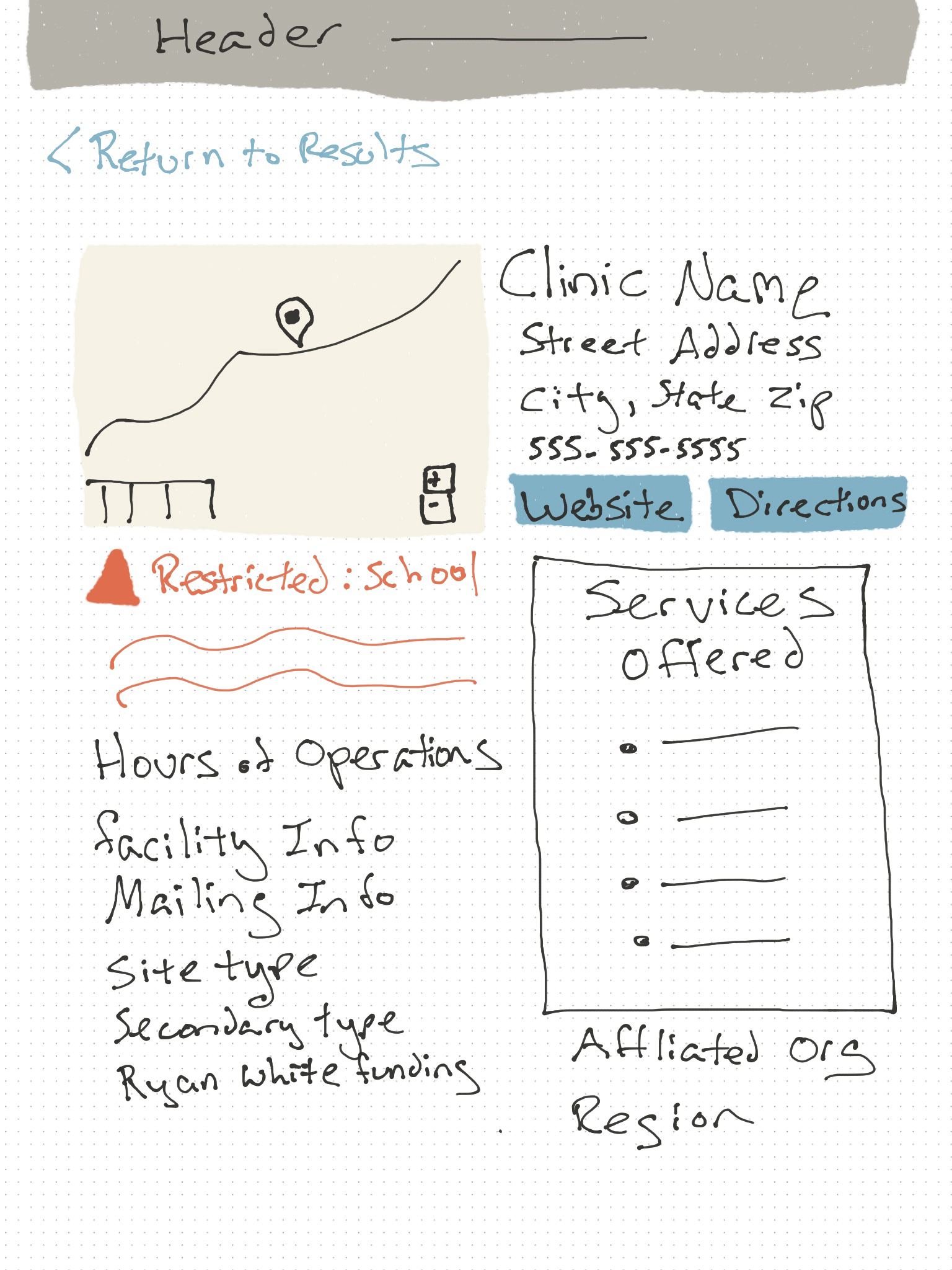
Hand sketch of search results page
Build
With the requirements, designs, and technical exploration completed in the first two phases. The build phase was focused. Developers had been a part of the full process to find the solution, and so they were ready to build. There was very little need from the greater team outside of occasional questions and QA support.

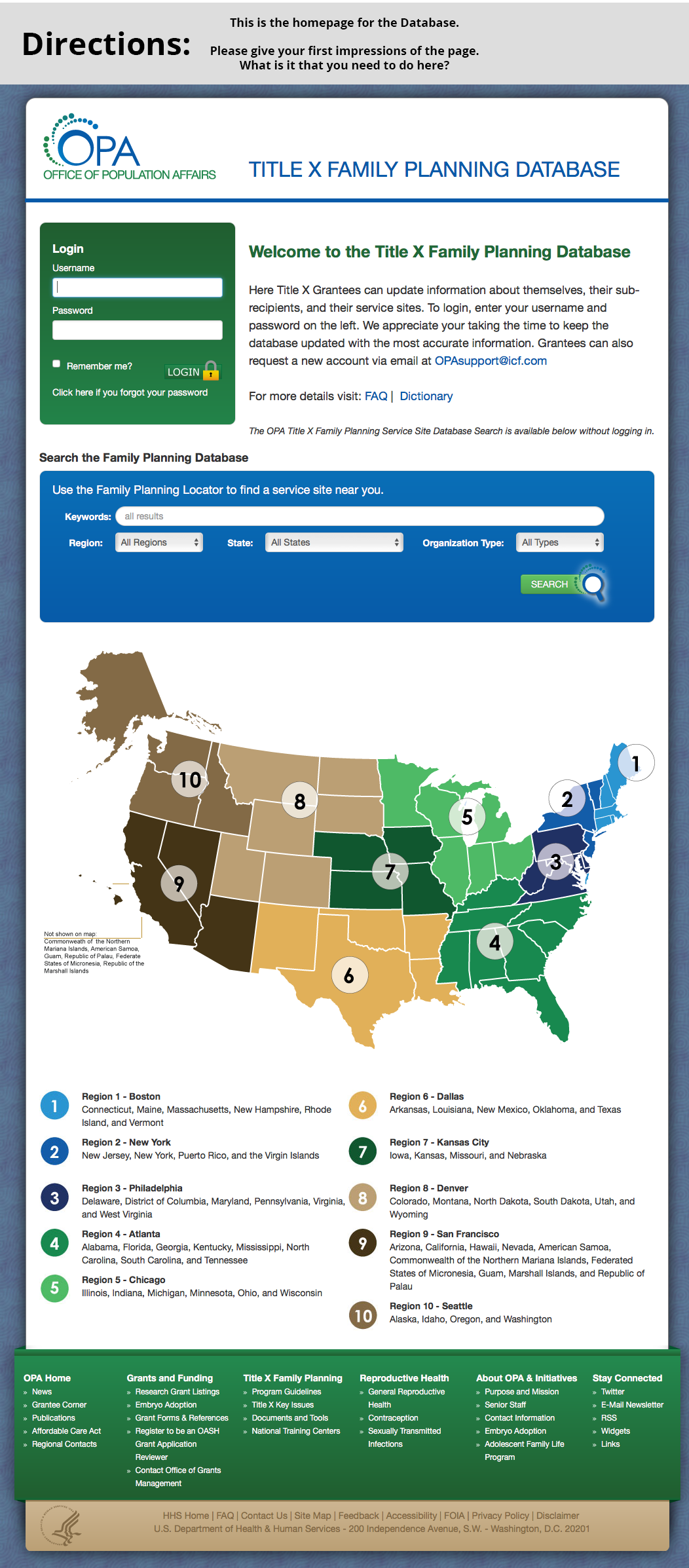
Home Page of live site
Solution
A brand new database, website and authoring environment allowed the ICF team to create a new experience which was better for both public users and authors.
For users, we created an interface was a simple site with a modern search and an attractive interface. The information provided was enough to let users know what they needed to know, without weighing them down with unnecessary details. Most importantly, it was determined that most user would like be on mobile, so it was important that the interface be responsive.
For authoring, we created a brand new workflow. This including adding service site users as a user type, since they are in the clinics and know a lot more about what is happening there. We then built a custom workflow with strict governance and approval rules to allow site and grant users to keep their information up-to-date. It was of great importance to understand that our authors were not the typical CMS authors, but were themselves clients using the system. It needed to be extremely easy for them to find their information and know what they needed to update. We also created features in the system to help alert users when their information was due for evaluation and the status of their submissions.
Reporting was the last area of improvement we built, although it was considered from the beginning through the architecture of the rest of the site. We had discussed with OPA the types of reports that they were creating – many of them outside of the system. Once all the data was available through the CMS we were actually able to create both their standard reports and a tool that let them customize all the information in an easy to use interface.
See OPA Locator