SAMHSA’s Center for Behavioral Health Statistics and Quality (CBHSQ)
When the ICF team began working on CBSHQ Data website site had significant usability issues. There were competing priorities that complicated the home page leaving users confused about what actions they should take. The primary purpose of the site, reports and data tables, were lost in the tabs and accordions experience that users did not know how to navigate. CBHSQ authors routinely created landing pages to point to their report just to help users navigate. And often had to answer help request from people who could not find what they needed.
Methods
We can the project with several Rapid Strategy sessions to help up learn the needs of the project and present back our learnings in the forms of Listening Session Results which included Visual Notes, Personas, and User Tasks Analysis. We used Content Inventories and Audits to make an assessment of content needs and to ultimately organize the site structure. Competitive Analysis documents were presented to the client to help demonstrate our perspective for a cleaner, more organized space, by showing who is doing it well. Examples were given for both other government sites and private sector sites. The client was still grasping the concepts of responsive design, so we decided to build functional wireframes in HTML to give them a sense of how the page would respond to different breakpoints. We were also able to mimic functional concepts such as end notes that appear in modals so the user would not loose their place in the text. Collaboration was our biggest tool. We made sure to have plenty of presentation and discussion sessions with the COR and with stakeholders who's input she believed was imperative.
Solution
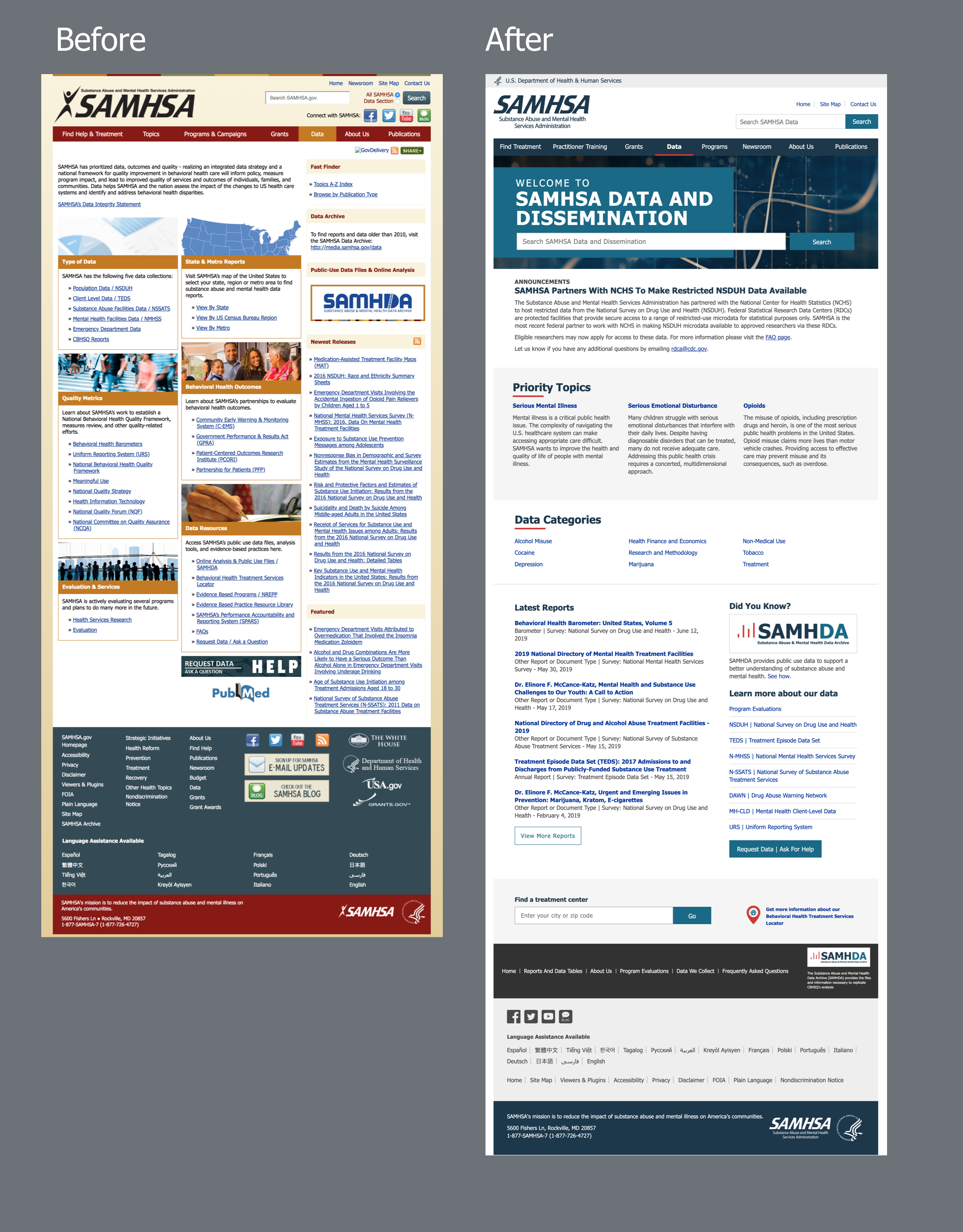
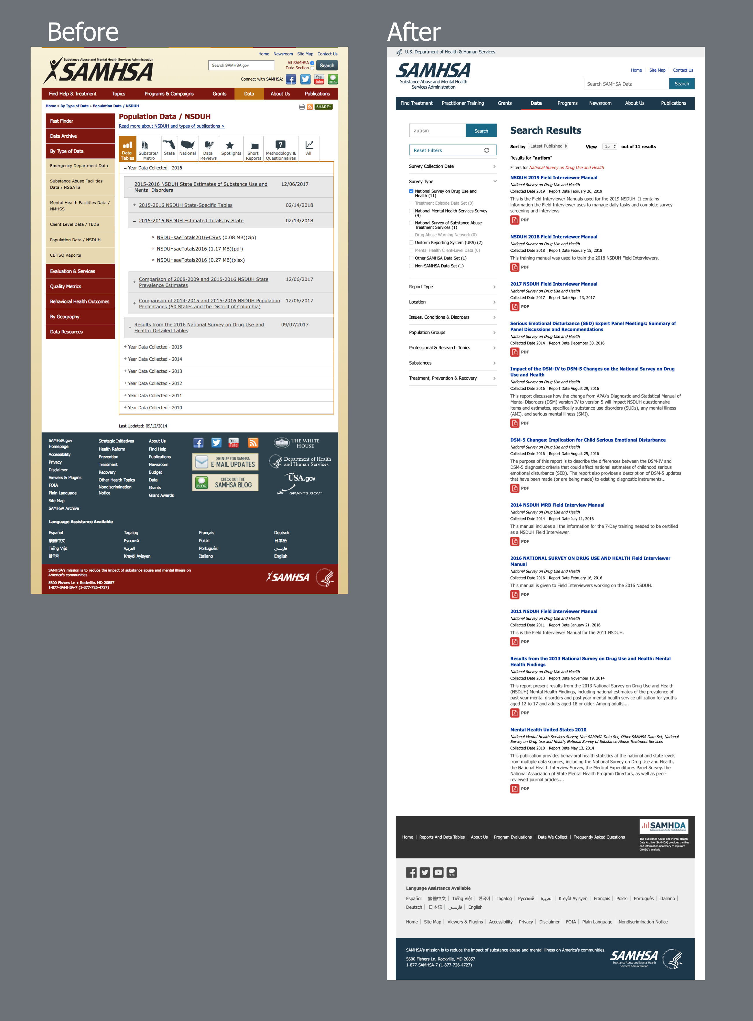
ICF restructured the front-end experience for the Data section to make their core offering, reports and data tables, the star of the site. The purpose of the redesign was to improve the usability and overall findability of the content. All of these documents where moved into a search interface and the search was placed front and center on the home page. Topic pages were also created to help funnel users to items that filled both user interest and were priorities from the administration. These pages were promoted on the home page as well with a clear pathway leading to the reports. Along with a module showing the latest reports and tables, users were given multiple pathways to travel that matched with their own internet habits for searching and browsing.
CBHSQ has several data collections that are used to survey the population. Explaining the work that each survey team performed and the output of that information was the next important task to focus on. For this, we created landing pages for each survey collection. These pages explained the history of the survey, explained the their different report products, and housed resources that showed how the surveys were conducted. These pages also featured links to the reports and data tables assuring that those documents remained front and center.
See CBHSQ Data
Before and After
Home Page

Accordion & Tab combination replaced by Search
